TWiki Variables » Search » Category: Editing & Content Update
Variables in this category:
- BUBBLESIG -- show bubble box and user signature with profile picture icon
- COLORPICKER{} -- color picker for use in HTML forms for TWiki applications
- COMMENT{ attributes } -- insert an edit box into the topic to easily add comments.
- DATEPICKER{} -- pop-up calendar to select a date for use in HTML forms
- EDITACTION -- select an edit template
- EDITFORM{} -- render a TWiki form for edit
- EDITFORMFIELD{"fieldname" form=""} -- render an input field specified in a form template topic
- EDITTABLE{ attributes } -- edit TWiki tables using edit fields and other input fields
- TWIKISHEET{} -- enable TWiki Sheet (spreadsheet) and set options
- USERSIG -- show user signature with profile picture icon
BUBBLESIG -- show bubble box and user signature with profile picture icon
- Syntax:
%BUBBLESIG{WikiName}%or%BUBBLESIG{WikiName - YYYY-MM-DD}% - The parameter can be either just the WikiName of a user, or by convention the WikiName followed by a dash and the date
- Example:
-- %BUBBLESIG{TWikiGuest - 2025-07-12}% - Expands to:
-- TWiki Guest - 2025-07-12
- Category: EditingAndContentUpdateVariables, FormattingAndRenderingVariables, UsersAndAuthenticationVariables
- Related: USERREPORT, USERSIG, UserList, UserReports (this topic)
COLORPICKER{} -- color picker for use in HTML forms for TWiki applications
- The
%COLORPICKER{}%variable is handled by the ColorPickerPlugin. - Syntax:
%COLORPICKER{ name="..." value="..." }% - Parameters:
Parameter Description Default Example nameName of input field (required) name="text_color"valueInitial color value, in hexadecimal notation for the combination of Red, Green, and Blue color values (RGB). (none) value="#0000ff"sizeSize of input field, in number of characters (browser default) size="8"classCSS class of input field or the rectangular color block (none) class="twikiInputField"styleStyle of input field or the rectangular color block (none) style="width: 190px; height: 32px"typeType of color widget:
•"below"- color picker is located below the input field;
•"popup"- pop-up a color picker window when clicking the button next to the input field
(this uses very little vertical space);
•"view"- a read-only rectangular block colored in the color value (no color picker);
•"view-hex"- likeview, in addition shows the color value as an RGB hexadecimal code (no color picker);type="below"type="view-hex"Additional parameters can be supplied; they will be added to the HTML input field or the rectangular color block. - Example:
<form action="...">
%COLORPICKER{ name="text_color" value="#123456" class="twikiInputField" type="popup" }%
<form>
Renders as:
- Category: ApplicationsAndComponentsVariables, DatabaseAndFormsVariables, EditingAndContentUpdateVariables, FormattingAndRenderingVariables, UIAndVisualizationVariables
- Related: ColorPickerPlugin, TWikiForms (this topic)
COMMENT{ attributes } -- insert an edit box into the topic to easily add comments.
- A
%COMMENT%without parameters shows a simple text box. - A
%COMMENT{}%can handle the following parameters:Parameter Description Default typeThis is the name of the template to use for this comment. Comment templates are defined in a TWiki template - see customization. If this attribute is not defined, the type is whatever is defined by COMMENTPLUGIN_DEFAULT_TYPE, either in this topic or in your WebPreferences. "below"defaultDefault text to put into the textarea of the prompt. targetName of the topic to add the comment to the current topic locationRegular expression specifying the comment location in the target topic. Read carefully the CommentPlugin documentation! modeFor compatibility with older versions only, synonymous with typenonotifySet to "on" to disable change notification for target topics "off"noformSet to "on" to disable the automatic form that encloses your comment block - remember to insert <form>tags yourself! See CommentPluginExamples#noform for an example."off"nopostSet to "on" to disable insertion of the posted text into the topic. "off"removeSet to "on" to remove the comment prompt after the first time it is clicked. "off"buttonButton label text "Add comment"emailtoSend comment by email. Use comma "," to seperate multiple email addresses. This feature is disabled by default. To enable this feature, please set up "$TWiki::cfg{Plugins}{CommentPlugin}{EmailEnabled} = 1;".
- See CommentPlugin for more information
- Category: ApplicationsAndComponentsVariables, DatabaseAndFormsVariables, EditingAndContentUpdateVariables, WorkflowAndAutomationVariables
- Related: HIDE, TWikiForms (this topic)
DATEPICKER{} -- pop-up calendar to select a date for use in HTML forms
- The
%DATEPICKER{}%variable is handled by the DatePickerPlugin. - Syntax:
%DATEPICKER{ name="..." value="..." }% - Parameters:
Parameter Description Default Example nameName of input field.
φ: No output is shown if the name parameter is missing, but the CSS and Javascript are loaded.(requiredφ) name="Start"valueInitial date value. ""(today)value="2012-12-31"formatFormat of resulting date value.
•%a- abbreviated weekday name
•%A- full weekday name
•%b- abbreviated month name
•%B- full month name
•%C- century number
•%d- the day of the month (00 ... 31)
•%e- the day of the month (0 ... 31)
•%H- hour (00 ... 23)
•%I- hour (01 ... 12)
•%j- day of the year ( 000 ... 366)
•%k- hour (0 ... 23)
•%l- hour (1 ... 12)
•%m- month (01 ... 12)
•%M- minute (00 ... 59)
•%n- a newline character
•%p- "PM" or "AM"
•%P- "pm" or "am"
•%S- second (00 ... 59)
•%s- number of seconds since Epoch (since Jan 01 1970 00:00:00 UTC)
•%t- a tab character
•%U,%W,%V- the week number. The week 01 is the week that has the Thursday in the current year, which is equivalent to the week that contains the fourth day of January. Weeks start on Monday.
•%u- the day of the week (1 ... 7, 1 = MON)
•%w- the day of the week (0 ... 6, 0 = SUN)
•%y- year without the century (00 ... 99)
•%Y- year including the century (ex. 2012)
•%%- a literal%character"%Y-%m-%d"format="%e %b %Y"idID of input field, optional. "id_"+ nameid="idStart"sizeSize of input field, in number of characters. (calculated as needed) size="12"classCSS class of input field. "twikiInputField"class="dateField"Additional HTML input field attributes, such as alt,disabled,maxlength,onblur,onchange,onfocus,readonly,style,tabindex,title - Example:
<form action="...">
%DATEPICKER{ name="Start_Date" }%
<form> - Expands to:
- Category: ApplicationsAndComponentsVariables, DatabaseAndFormsVariables, DateAndTimeVariables, EditingAndContentUpdateVariables, FormattingAndRenderingVariables, UIAndVisualizationVariables
- Related: DatePickerPlugin, TWikiForms (this topic)
EDITACTION -- select an edit template
- EDITACTION defined in a topic or preference setting will define the use of an editaction template instead of the standard edit. If EDITACTION is defined as
text, then hide the form. If EDITACTION is defined asformhide the normal text area and only edit the form. - Syntax:
%EDITACTION%(returning eithertextorform) - Expands to: %EDITACTION%
- Note: When EDITACTION is defined as text or form the Edit and Edit Raw buttons simply add
;action=textor;action=formto the URL for the edit script. If you have defined EDITACTION in a topic setting or preference setting you can still edit the topic content or the form by removing the;action=formor;action=textfrom the edit URL in the browser and reload. - Category: AdministrationVariables, EditingAndContentUpdateVariables, SkinsAndTemplatesVariables
- Related: TWikiScripts#edit (this topic)
EDITFORM{} -- render a TWiki form for edit
- Show an HTML form to update the TWiki form data of a topic.
- Syntax to update a TWiki form:
%EDITFORM{topic="..." formfields="..."}% - Supported parameters:
Parameter: Description: Default: "..."or
topic="..."Name of topic containing the TWiki form, such as "Bug1234". Specify topic name orWeb.TopicNameEither "...",topic=""
orformtemplate=""
is requiredformtemplate="..."Name of form template topic, such as "BugForm". Specify topic name orWeb.TopicNameelements="..."Elements of edit form: formstartis the HTML form tag,headerthe form header,formfieldsthe form fields,submitthe submit button,hiddenfieldsare hidden input fields,formendis the HTML form end tag."formstart, header,
formfields, submit, hiddenfields, formend"header="..."Form header, typically containing the form name. If "on", the default format is used:
"| *[[$formweb.$formtopic][$formtopic]]* ||"
Supported variables:
•$formweb- name of web containing the form definition.
•$formtopic- name of topic containing the form definition."on"formfields="..., ..."Specify names of TWiki form fields to use, in sequence. The alltoken shows all remaining fields."all"format="..."Format of one form field. Supported variables:
•$inputfield- rendered form input field.
•$title- raw field name (includes space and other special characters).
•$name- field name (sanitized title).
•$size- size of field or selector.
•$value- initial value, or select options.
•$tooltip- tooltip message.
•$attributes- type attributes, such as H for hidden, M for mandatory.
•$extra- extra information, such as * for mandatory field.
•$formweb- name of web containing the form definition.
•$formtopic- name of topic containing the form definition.
See details in TWikiForms#FormFieldTypes."| $title: $extra | $inputfield |"hiddenfields="..., ..."List of form field names to use as hidden fields. For each name listed in hiddenfields="", add aname="value"parameter to specify the value of the hidden input field. If you omit thename="value"parameter for a hidden input field, it will be excluded as a form field, even with aformfields="all".""submit="..."Format of submit button row. Line separator. Variable $submitexpands to submit input field with label "Save",$submit(Save)to a submit input field with specific label."| | $submit |"onsubmit="..."Execute JavaScript when the form is submitted, optional. ""action="..."Specify a TWiki script ( view,edit,save, ...), or the full URL of an action to take on form submit."save"method="..."HTML form action method. "post"for save
action, else"get"separator="..."Line separator. Variable $brexpands to<br />tag, and$nto a newline."$n"default="..."Text shown when no form or form fields are found "" - Example:
%EDITFORM{ topic="%INCLUDINGTOPIC%" }%- show HTML form to update form data of the including topic (typically used in an included header) - Example: Custom form in an included header to update some form field values of the base topic, including one hidden field:
%EDITFORM{
topic="%BASEWEB%.%BASETOPIC%"
formfields="Priority, Status"
hiddenfields="Updated"
Updated="%SERVERTIME{$year-$mo-$day}%"
submit=" | | $submit(Update) |"
}% - Category: DatabaseAndFormsVariables, DevelopmentVariables, EditingAndContentUpdateVariables
- Related: EDITFORMFIELD, ENCODE, ENTITY, FORM, FORMFIELD, META, METASEARCH, SEARCH, TWikiForms, FormattedSearch, QuerySearch, SearchHelp, TWikiScripts, TWikiTemplates (this topic)
EDITFORMFIELD{"fieldname" form=""} -- render an input field specified in a form template topic
- Use this to create HTML forms that update TWikiForms, such as a custom "create new topic" form, or a topic header that allows users to change some form values at the top of the page. A valid form is composed of a start form type, various form fields, a submit type, and an end form type.
- Syntax:
-
%EDITFORMFIELD{"fieldname" form="...Form"}%- create form field defined in a TWiki Form template -
%EDITFORMFIELD{"fieldname" topic="..."}%- create form field based on a topic that has a TWiki Form & initialize its value -
%EDITFORMFIELD{"fieldname" type="..."}%- create an HTML input field
-
- Supported parameters:
Parameter: Description: Default: "fieldname"The name of a TWiki form field or HTML form field. Required form="..."Name of form template topic, such as "BugForm". Specify topic name orWeb.TopicNameEither formortopic
is required unless
typeis specifiedtopic="..."Name of topic containing form, such as "Bug1234". Specify topic name orWeb.TopicNameformat="..."Format string. Supported variables:
•$inputfield- rendered form input field.
•$title- raw field name (includes space and other special characters).
•$name- field name (sanitized title).
•$size- size of field or selector.
•$value- initial value, or select options.
•$tooltip- tooltip message.
•$attributes- type attributes, such as H for hidden, M for mandatory.
•$extra- extra information, such as * for mandatory field.
See details in TWikiForms#FormFieldTypes. This parameter is ignored iftype="..."is specified."$inputfield"value="..."Initial value of input field. If omitted and if topic="..."is specified, the value is taken from the named form field.""type="start"Special case: Start an HTML form. Parameters:
"form" type="start" action="save" topic="..." method="" onsubmit="" onreset=""
•action: Specify a TWiki script (view,edit,save, ...), or a full action URL, default"view".
•topic: Specify topic name orWeb.TopicName, default current topic; ignored if full action URL is provided.
•method: HTML form action method, default"post"for save action, else"get".
•onsubmit: Execute JavaScript when the form is submitted, optional.
•onreset: Execute JavaScript when the reset button is clicked, optional.""type="end"Special case: End an HTML form. Parameters:
"form" type="end"""type="..."Special case: Create an input field regardless of the type defined in the TWikiForm. Used mainly for hidden fields and submit button. The nameless parameter is the field name. Supported types:
•"fieldname" type="hidden" value="..."- hidden input field.
•"fieldname" type="submit" value="..."- submit button,valueis button label.
•"fieldname" type="button" value="..." onclick="..."- regular button,valueis button label.
•"fieldname" type="text" value="..." size="80"- text input field.
•"fieldname" type="textarea" value="..." size="80x6"- multi line text area field,sizedenotes columns x rows.
•"fieldname" type="checkbox" value="..." text="..."- checkbox,textis display text.
•"fieldname" type="radio" value="..." text="..."- radio button,textis display text.
• In addition, any valid XHML and HTML5 input type is supported, such astype="date",type="file",type="image".
Additional type-specific parameters can be supplied, such asalt="...",checked="checked",class="...",max="...",min="...",placeholder="...",src="...",style="...",width="...". Consult HTML documentation."" - Example:
%EDITFORMFIELD{ "ReleaseType" form="PackageForm" value="Beta-1" }% - Example: Custom form in an included header to update some values of the base topic
%EDITFORMFIELD{ "form" type="start" action="save" topic="%BASEWEB%.%BASETOPIC%" method="post" }%
| Priority: | %EDITFORMFIELD{ "Priority" topic="%BASETOPIC%" }% |
| Status: | %EDITFORMFIELD{ "Status" topic="%BASETOPIC%" }% |
| | %EDITFORMFIELD{ "form" type="submit" value="Update" }% |
%EDITFORMFIELD{ "Updated" type="hidden" value="%SERVERTIME{$year-$mo-$day}%" }%
%EDITFORMFIELD{ "form" type="end" }% - Category: DatabaseAndFormsVariables, DevelopmentVariables, EditingAndContentUpdateVariables
- Related: EDITFORM, EDITTABLE, FORM, FORMFIELD, METASEARCH, SEARCH, TWikiForms, FormattedSearch, QuerySearch, SearchHelp, TWikiScripts, TWikiTemplates (this topic)
EDITTABLE{ attributes } -- edit TWiki tables using edit fields and other input fields
- The
%EDITTABLE{}%variable is handled by the EditTablePlugin - Syntax:
%EDITTABLE{ attributes }%
- Supported attributes:
Attribute Comment Default headerSpecify the header format of a new table like "|*Food*|*Drink*|". Useful to start a table with only a button(no header) formatThe format of one column when editing the table. A cell can be a text input field, or any of these edit field types:
• Text input field (1 line):
| text, <size>, <initial value> |
• Textarea input field:
| textarea, <rows>x<columns>, <initial value> |
• Drop down box:
| select, <size>, <option 1>, <option 2>, etc* |
*only one item can be selected
• Radio buttons:
| radio, <size*>, <option 1>, <option 2>, etc |
*size indicates the number of buttons per line in edit mode
• Checkboxes:
| checkbox, <size*>, <option 1>, <option 2>, etc |
*size indicates the number of checkboxes per line in edit mode
• Fixed label:
| label, 0, <label text> |
• Row number:
| row, <offset> |
• Date:
| date, <size>, <initial value>, <DHTML date format*> |
*see Date Field Type"text, 16"
for all cellschangerowsRows can be added and removed if "on"
Rows can be added but not removed if"add"
Rows cannot be added or removed if"off"CHANGEROWS
plugin settingquietsaveQuiet Save button is shown if "on", hidden if"off"QUIETSAVE
plugin settingincludeOther topic defining the EDITTABLE parameters. The first %EDITTABLE% in the topic is used. This is useful if you have many topics with the same table format and you want to update the format in one place. (none) helptopicTopic name containing help text shown below the table when editing a table. The %STARTINCLUDE% and %STOPINCLUDE% variables can be used in the topic to specify what is shown. (no help text) headerislabelTable header cells are read-only (labels) if "on"; header cells can be edited if"off"or "0""on"editbuttonSet edit button text, e.g. "Edit this table"; set button image with alt text, e.g."Edit table, %PUBURL%/%SYSTEMWEB%/TWikiDocGraphics/edittopic.gif"; hide edit button at the end of the table with"hide"(Note: Button is automatically hidden if an edit button is present in a cell)EDITBUTTON
plugin settingbuttonrowSet to topto put the edit buttons above the table.bottomjavascriptinterfaceUse javascript to directly move and delete row without page refresh. Enable with "on", disable with"off".JAVASCRIPTINTERFACE
plugin settingredirecttoSet up a return page after saving changes. e.g By setting redirectto="%BASEPAGE%", you can return to base page if your editable table is included by another page. (none)
- Example:
%EDITTABLE{ format="| text, 20 | select, 1, one, two, three |" changerows="on" }%
| *Name* | *Type* |
| Foo | two | - Category: DatabaseAndFormsVariables, EditingAndContentUpdateVariables, TablesAndSpreadsheetsVariables
- Related: See EditTablePlugin for more details (this topic)
TWIKISHEET{} -- enable TWiki Sheet (spreadsheet) and set options
- The
%TWIKISHEET{}%variable is handled by the TWikiSheetPlugin - Syntax:
%TWIKISHEET{ parameters }% - Supported parameters:
Parameter Description 
Example Default more... Additional Handsontable options  can be used. Notes on types of values:
• Number value: Specify the number, such aswidth="500"
• String value: Enclose the string in single quotes, such aspreventOverflow="'horizontal'"
• Boolean value: Specify"true"or"false", such asmanualRowResize="true"
• Array value: Specify the array, such asmanualRowResize="[40, 50]"
• Object value: Specify the object, such ascolumnSorting="{ column: 2, sortOrder: true }"
• Function: Specify the JavaScript function, such as:
cells="function( row, col, prop ) { var cp = {}; if( row===0 ) { cp.readOnly = true; } return cp; }"concurrentConcurrent editing. If enabled, multiple people can edit TWiki Sheet and see each other's changes. This includes editing cells, pasting a range of cells, drag-filling cells, adding/removing rows, adding/removing columns, and undo.
•concurrent="0"- disable concurrent editing; changes by others will be shown after a page reload.
•concurrent="1"- enable concurrent editing; changes by others will show up while editing TWiki Sheet.concurrent="1"{Plugins}
{TWikiSheetPlugin}
{ConcurrentEdit}
configure
setting ("0")contextMenuDefines the right-click context menu; set to "false"to disable; set to array of available strings, such as:
contextMenu="['row_above', 'row_below', 'col_left', 'col_right', 'remove_row', 'remove_col', '---------', 'undo', 'redo']"contextMenu="false"contextMenu="true"fixedColumnsLeftFixed number of columns shown on the left; takes effect if widthparameter is usedfixedColumnsLeft="2"(none) fixedRowsTopFixed number of rows shown on top; takes effect if heightparameter is usedfixedRowsTop="1"(none) formulasFormula support; set to "false"to disable spreadsheet calculations in table cells, such as:=SUM(A1:A8)formulas="false"formulas="true"maxColsMaximum number of columns maxCols="10"(unlimited) maxRowsMaximum number of rows maxRows="1000"(unlimited) modeMode of operation:
•mode="classic"- regular TWiki table and an edit button; once pressed, the table switches into spreadsheet edit mode.
•mode="toggle"- spreadsheet in read-only mode and an edit button; once pressed, the table switches into spreadsheet edit mode.
•mode="toggle-edit"- like"toggle"but initial state is spreadsheet edit mode.
•mode="edit"- the table is always in spreadsheet edit mode.mode="edit"{Plugins}
{TWikiSheetPlugin}
{Mode}
configure
setting ("toggle")saveOptionally disable save; useful to demo the plugin save="0"save="1"colHeadersSet to "false"to disable the default column headers (A, B, C); set to a function for custom headers, such as:
colHeaders="function(index) { return String.fromCharCode(65+index) + ' (' + (index + 1) + ')'; }",
which will show headersA (1),B (2),C (3), ...colHeaders="false"colHeaders="true"rowHeadersSet to "false"to disable the default row headers (1, 2, 3)rowHeaders="false"rowHeaders="true"heightTable height in pixels; a vertical scrollbar is added if needed height="300"(full table height) widthTable width in pixels; a horizontal scrollbar is added if needed width="500"(full window width) minSpareColsWhen set to 1 (or more), automatically add a new column at the right if there are no more empty columns minSpareCols="1"minSpareCols="0"minSpareRowsWhen set to 1 (or more), automatically add a new row at the bottom if there are no more empty rows minSpareRows="1"minSpareRows="0"wordWrapWord wrap; set to "false"to disable cell content wrapping if it does not fit in the fixed column widthwordWrap="false"wordWrap="true" - Example:
%TWIKISHEET{ mode="edit" save="0" }%
| | 16Q1 | 16Q2 | 16Q3 | 16Q4 |
| East: | 163 | 182 | 208 | 193 |
| Center: | 82 | 97 | 126 | 91 |
| West: | 217 | 231 | 294 | 249 |
| Total: | =SUM(B2:B4) | =SUM(C2:C4) | =SUM(D2:D4) | =SUM(E2:E4) |
| Min: | =MIN(B2:B4) | =MIN(C2:C4) | =MIN(D2:D4) | =MIN(E2:E4) |
| Max: | =MAX(B2:B4) | =MAX(C2:C4) | =MAX(D2:D4) | =MAX(E2:E4) |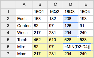
- Category: DatabaseAndFormsVariables, EditingAndContentUpdateVariables, FormattingAndRenderingVariables, TablesAndSpreadsheetsVariables
- Related: See TWikiSheetPlugin for more details (this topic)
USERSIG -- show user signature with profile picture icon
- Syntax:
%USERSIG{WikiName}%or%USERSIG{WikiName - YYYY-MM-DD}% - The parameter can be either just the WikiName of a user, or by convention the WikiName followed by a dash and the date
- Example:
-- %USERSIG{TWikiGuest - 2025-07-12}% - Expands to:
-- TWiki Guest - 2025-07-12
- Category: EditingAndContentUpdateVariables, FormattingAndRenderingVariables, UsersAndAuthenticationVariables
- Related: BUBBLESIG, USERREPORT, UserList, UserReports (this topic)
Categories:
Administration, Applications & Components, Attachments & Files, Charting & Drawing, Database & Forms, Date & Time, Development, Editing & Content Update, Email & Notification, Export & Publishing, Formatting & Rendering, Import, Linking & Navigation, Searching & Listing, Security & Access Control, Skins & Templates, System Information, Tables & Spreadsheets, UI& Visualization, Users & Authentication, Workflow & Automation
 Edit | Attach |
 Topic revision: r1 - 2012-11-11 - TWikiContributor

 Site map
 Main web
 User registration
 Users
Users Groups
 Index
Index Search
 Changes
 Notifications
 RSS Feed
 Statistics
 Preferences
")
 Copyright © 1999-2025 by the contributing authors. All material on this collaboration platform is the property of the contributing authors.
 Ideas, requests, problems regarding TWiki? Send feedback
Note: Please contribute updates to this topic on TWiki.org at TWiki:TWiki.EditingAndContentUpdateVariables.